Metrics
Metrics
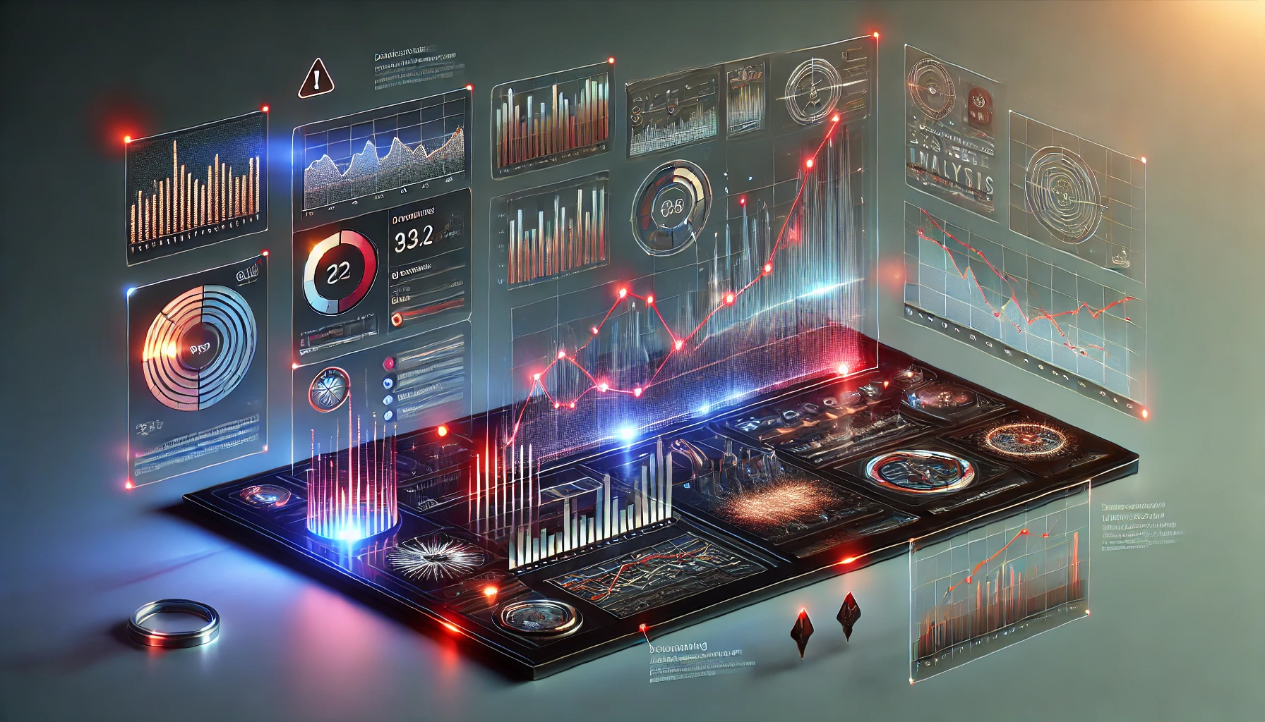
Tracked indicators, trend snapshots, and numerical evidence for the decline, drift, distortions, and recurring failures documented across the system.
METRICS STATUS: PARTIAL VISIBILITY WITH CONTINUING NUMERICAL DISTRESS
PRIMARY SIGNAL
Confidence Erosion
Public trust, institutional legitimacy, and shared reality indicators continue to weaken across multiple monitored categories.
TRAJECTORY
Negative With Momentum
The short-term line remains unstable, but the medium-term pattern suggests persistent degradation rather than isolated fluctuation.
DATA QUALITY
Compromised but Usable
Inputs remain noisy due to selective reporting, manipulated narratives, and the thriving marketplace for misleading certainty.
Signal Board
INSTITUTIONAL TRUST
32%
Placeholder metric for confidence in institutions.
MEDIA SATURATION INDEX
87
Placeholder metric for noise, repetition, and outrage churn.
POLICY COHERENCE
18%
Placeholder metric for consistency between stated goals and actual action.
PUBLIC ATTENTION SPAN
04:12
Placeholder metric for collective focus before the next manufactured emergency.
Overview
Use this section to explain what dataset or indicator group the reader is looking at, what timeframe matters, and how the numbers should be interpreted. This is where you establish credibility: define the signal, identify the source, and explain any caveats before the charts start doing rhetorical heavy lifting.
Keep the tone sharp, but let the numbers do the accusing. The best Metrics pages sound calm while documenting something deeply alarming.
Tracked Indicators
- Trust: confidence in institutions, electoral systems, media, or expert authority.
- Instability: frequency of disruptive events, reversals, scandals, or contradiction cycles.
- Visibility: whether the public can clearly see the pattern or is being buried under noise.
- Consequence: how much damage is being absorbed downstream by ordinary people.
- Normalization: how quickly the unacceptable is folded back into routine life.
Trend Notes
Use this section to summarize what the indicators are doing over time. Are they steadily worsening? Volatile but directionally bad? Temporarily improving for cosmetic reasons? This is where you help readers understand movement instead of just staring at isolated figures.
Where possible, compare short-term movement against the longer pattern. A small rebound in one week can still sit inside a much bigger decline over months or years.
Watch Conditions
- Sharp spikes after major events
- Artificial calm caused by media fatigue
- Contradictions between official messaging and lived impact
- Data gaps caused by selective reporting
- Numbers that improve only because the definition changed
Data Note
The strongest Metrics pages use a few memorable numbers, not a wall of statistics. Pick the indicators that best reveal the pattern, then let Analysis explain why those numbers matter.
Connected Systems
Dashboard
Surface the highest-priority signals on the homepage.
Analysis
Interpret what the numbers mean and who they implicate.
Media
Pair the indicators with clips, screenshots, and visual reference points.
Archive
Store the numbers, timeline, and prior signal history.
Metric accuracy may be affected by propaganda, lagging data, selective omission, and the aggressive monetization of confusion.